Improving the Renfe app experience
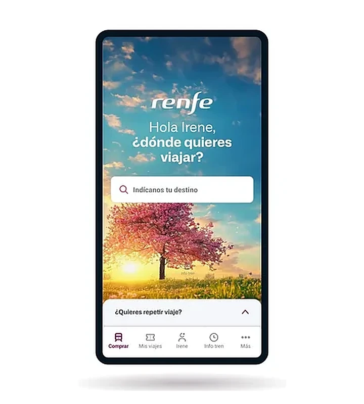
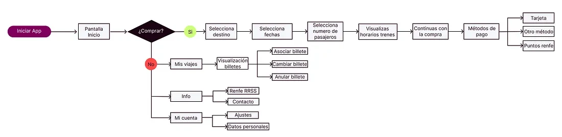
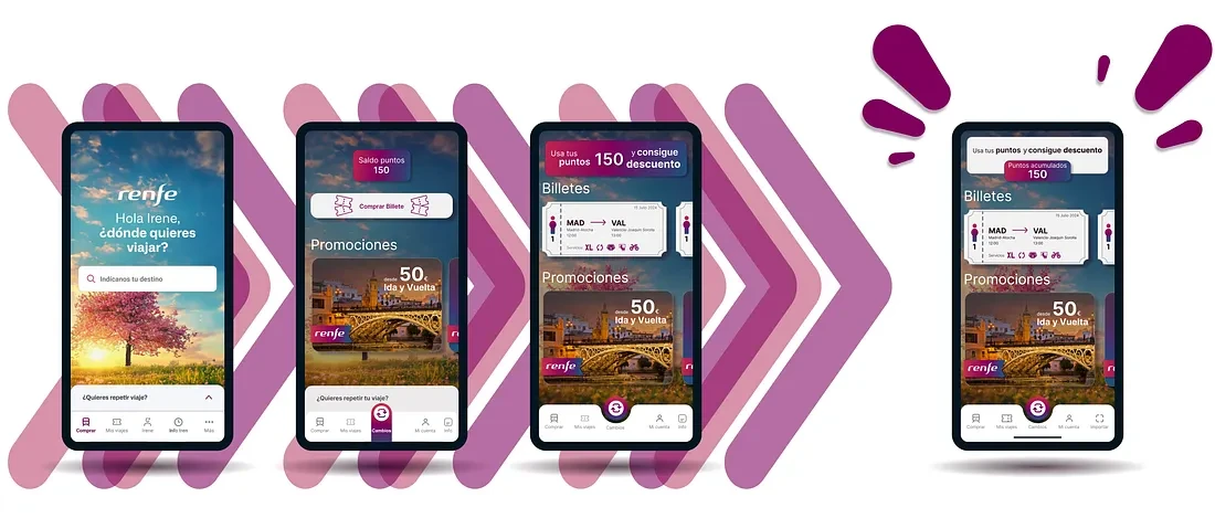
As a frequent train traveller I lived with Renfe's ticketing app for months. It's a clean purchase flow — but the home treats everyone like a first-time buyer: loyalty points buried, offers nowhere, no quick access to the ticket you're about to use.
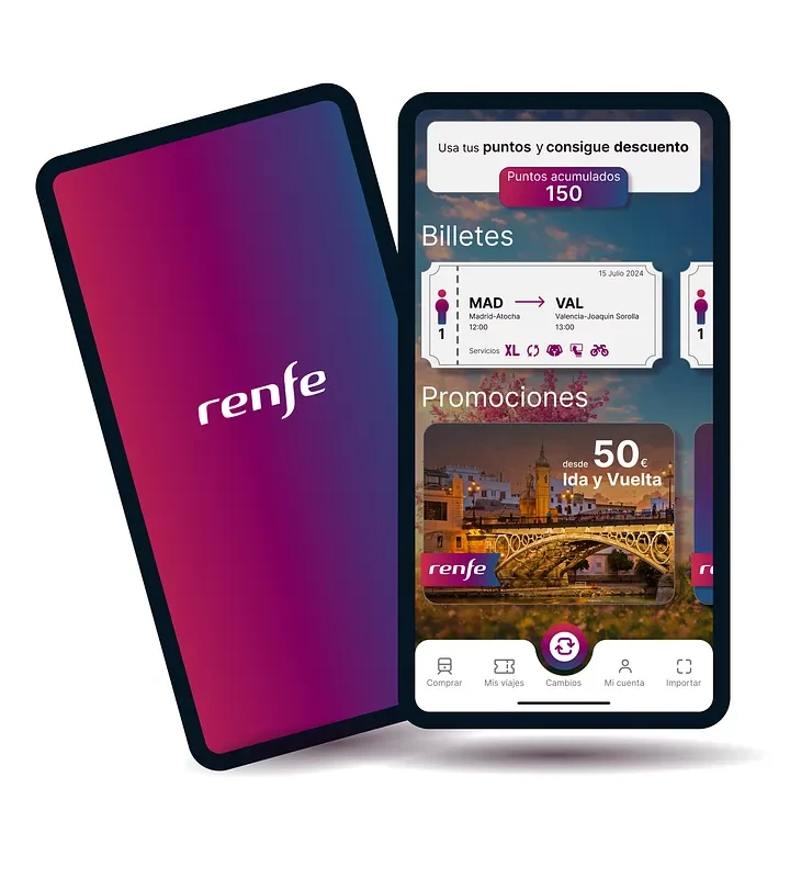
A self-initiated redesign of the home screen. I reframed it from a buy-a-ticket funnel into a value surface — points, offers and your active ticket up front — so the app rewards the habit it already runs on.
6home-screen changes, from funnel to retention surface
Read the full case study on MediumSolo · UX/UI (self-initiated)
2024
Personal project · concept redesign
Renfe app · home screen
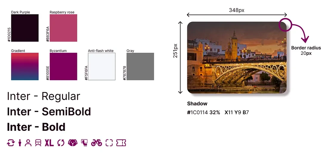
UX audit · Redesign · Style tile
The full story
The frictions I found and the full home-screen redesign — the complete write-up is on Medium.
Read on MediumArticle in Spanish
Next project
Building a Design System from Scratch