Dashboard Design: From a Screenshot Collage to a Real Data Tool
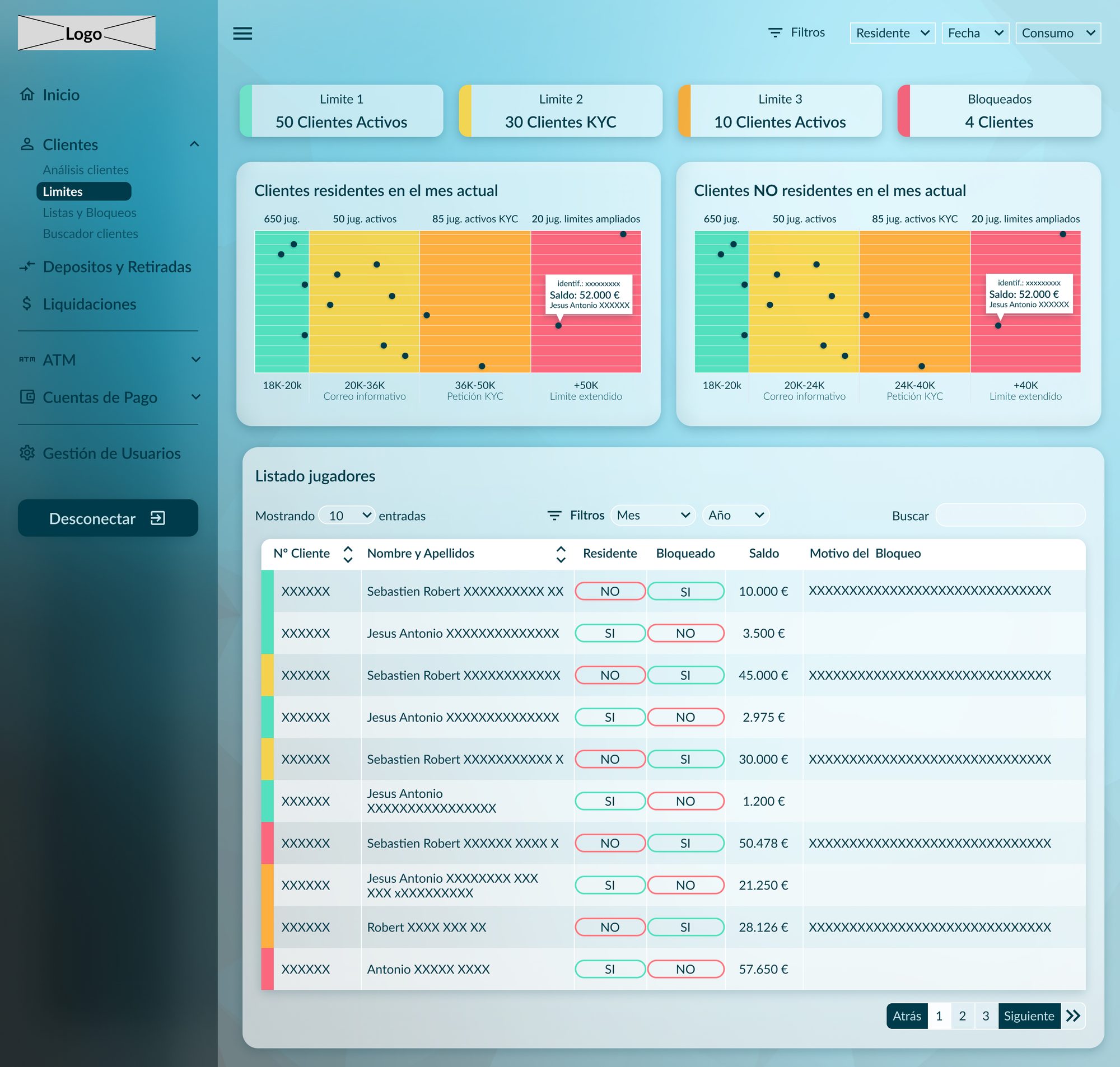
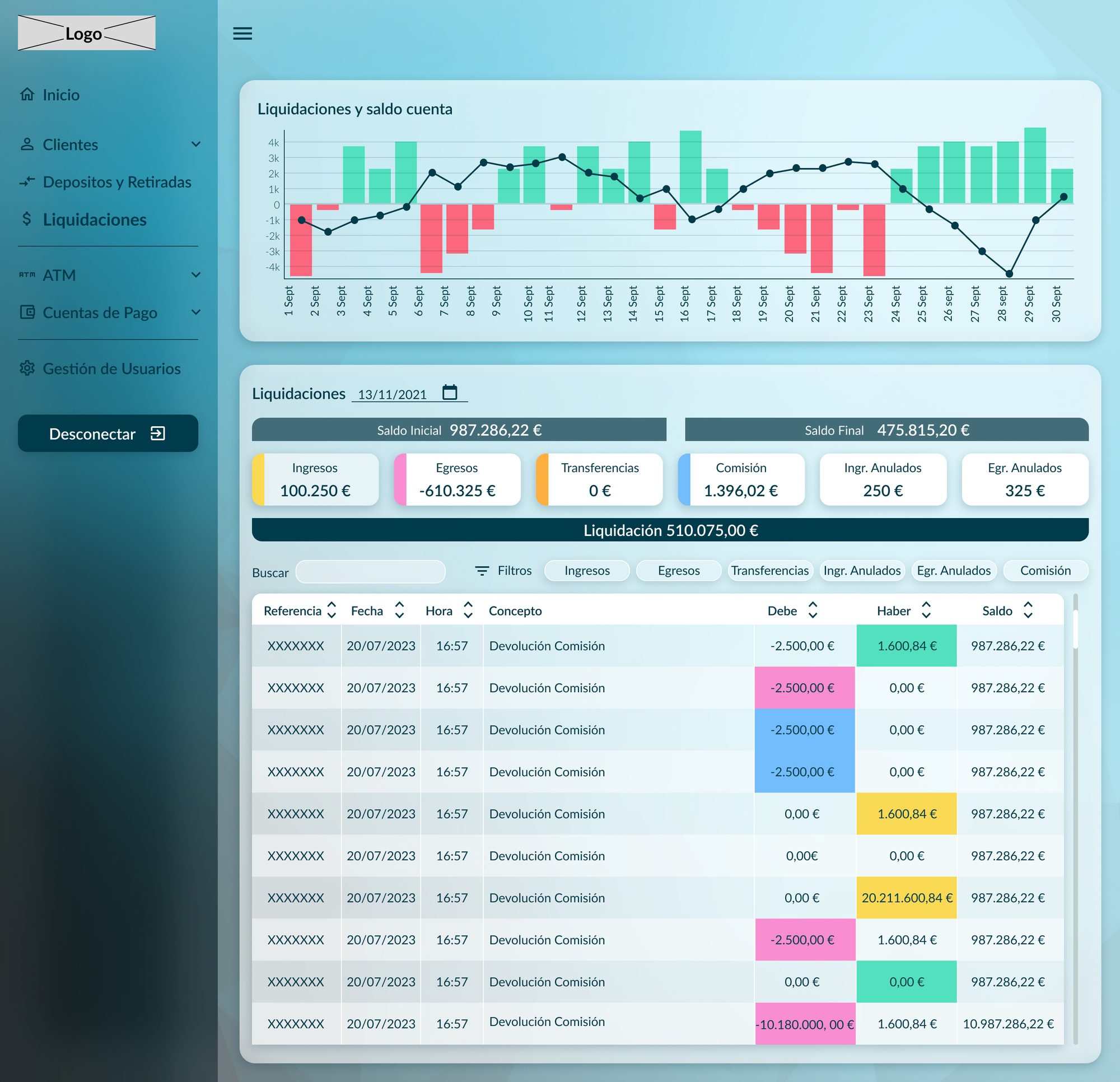
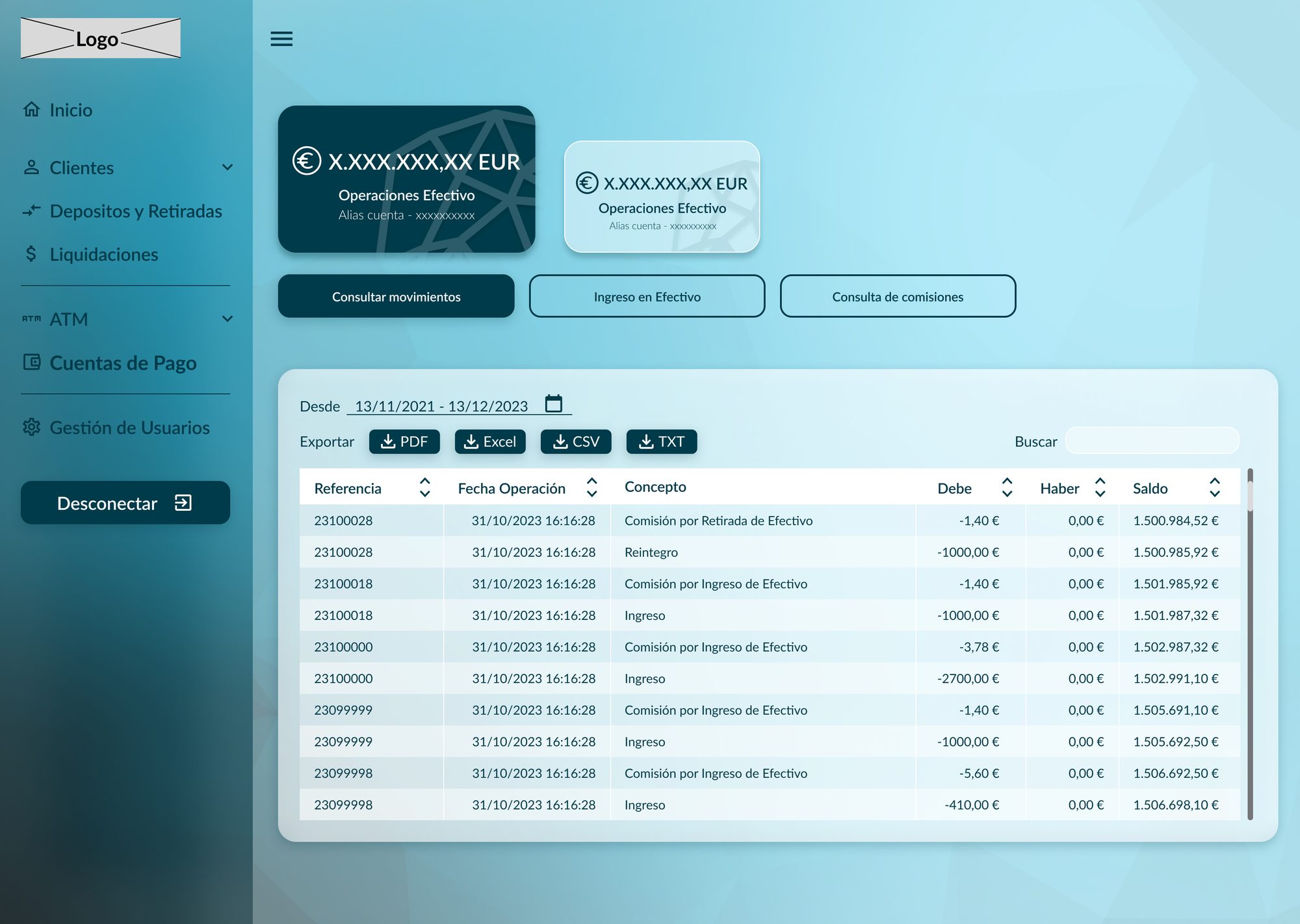
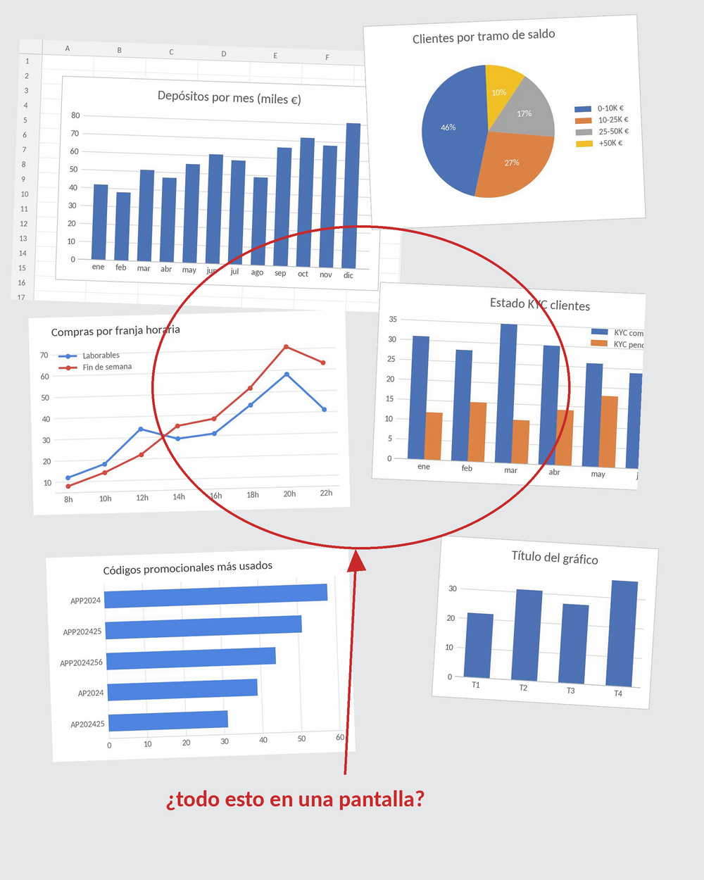
The project manager arrived with what he called the dashboard. I opened it expecting a wireframe, a structure, something with intention. What I found was a document made of screen clippings — identical charts stacked on top of each other, tables with no hierarchy, every graphic exactly the same regardless of what the data represented. No menu. No navigation. No visual hierarchy. The information was there; the story wasn't.
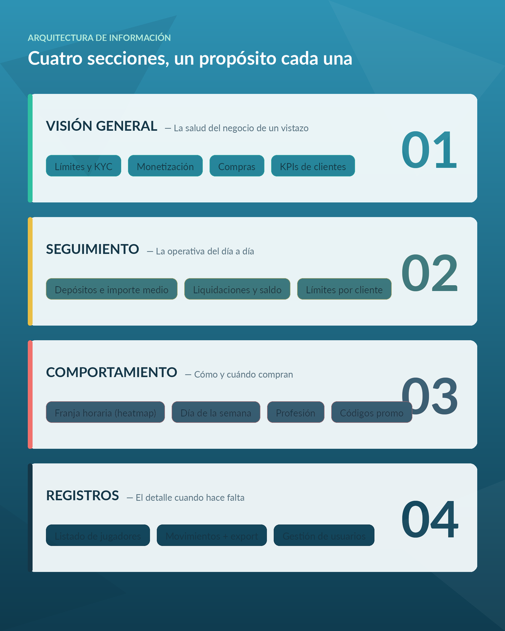
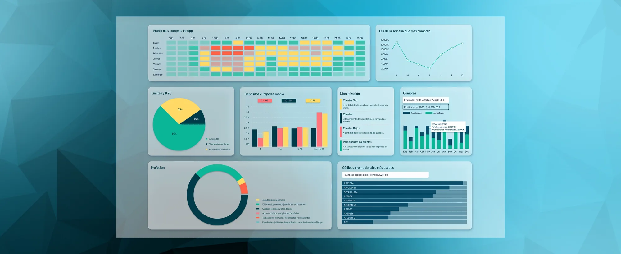
Before touching a single visual component I sat with the PM and started asking the questions that apparently no one had asked that document before: what's the most critical metric, who looks at this first, which numbers require daily attention and which are just monthly context? Those questions turned a flat panel into sections with purpose — and the dashboard has been in production for three years, now used as a sales tool to win new clients.
+150%growth in client adoption · in production for ~3 years
Read the full case study on MediumSolo · UX/UI Designer
2023
Metrics dashboard · regulated industry platform
Information architecture · Data visualisation
IA restructure · Chart selection · Glassmorphism UI · Figma
The full story
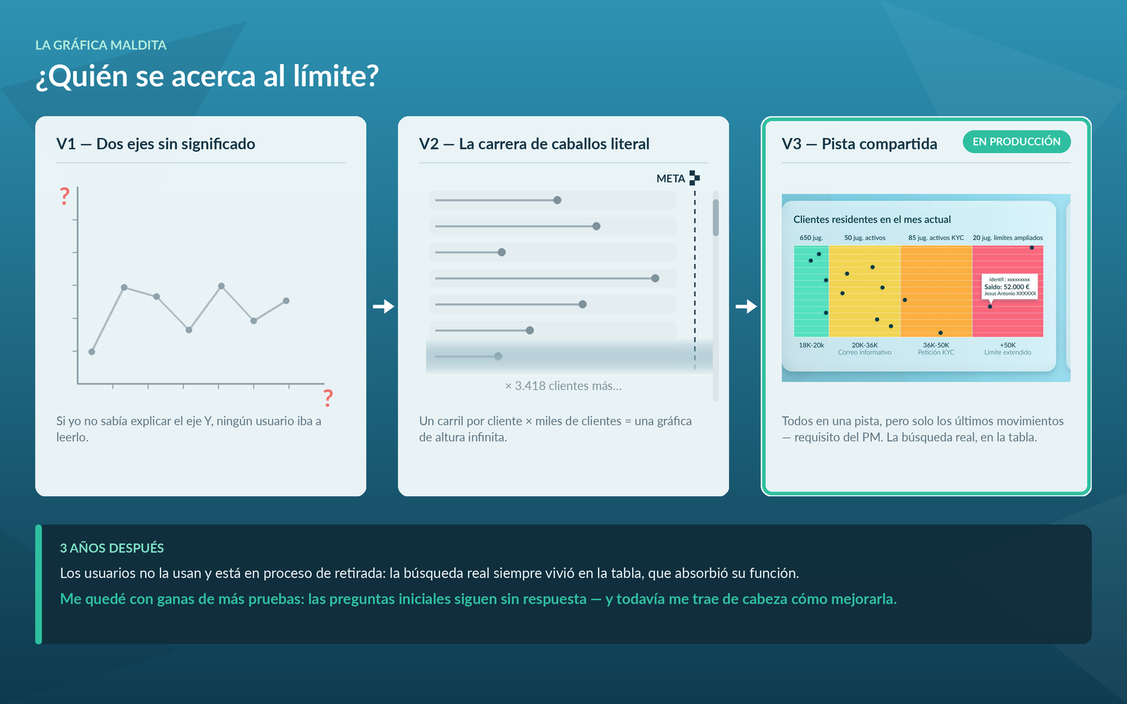
Chart iterations, real technical constraints, the component that took a week and still bothers me — the complete write-up is on Medium.
Read on MediumArticle in Spanish
Next project
Improving the Renfe app experience